Post by Leoshi on Nov 2, 2006 21:49:03 GMT -5
Well, since the second half of the picture isn't necessarily a Yoshi while the top is, I was a bit confused about where to post this. If I made an error, then by all means, I'll delete this at once.
DA Version: www.deviantart.com/deviation/42304602/
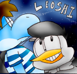
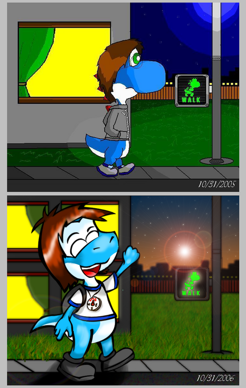
Anyway, that's what this is. Comparing my first ever pic of my character vs my most recent. Personally, I really don't think I have improved all that much, but I have seen other artists show their progress, so here I am, showing mine.
First of all, you may see my character, in the bottom screen, with a significantly longer tail and pointed snout. Well, I have been thinking, and I want to keep my character for a while. So I'll have to make Leoshi a non-Yoshi based character in the future to avoid all of those copyright issues, in case I decide to go places with him as a character in the real world. Nah, don't worry, I won't stop being a Yoshi. That's more of an alternative form, so I'll be prepared in the future. So yeah, I'm thinking of a more lizard-esque form. Obviously, I don't know anything about cartoon lizard anatomy (as clearly illustrated in the bottom half), so I'll make it my first project in the the second year of my existence on-line (aside from the flash movie, the fanfics, and the comics)
Ok, enough with all that. I know the characters don't really look too fitting with the backgrounds. I still haven't been able to improve with that after this full year. That's task one toward focusing improvement, certainly. I also seem to be still messing up with hands and arms. In the first one, the elbow appeared to have been a bit lower, whereas in the second one, you can't even see them because of the sleeves. I also seem to have made my arms in the second really skinny, but his supposed to be scrawny, so I guess it fits. Ah, and the hair, oh, how I feel that the hair is still way too 2D! I have read a lot of tutorials, though I can't seem to get it right. At the very least, I'm getting the hang of some tools. I mean, the top one was entirely in MS paint, before I had discovered the curving tool (which is why the lines look so strait). And wow... did I make noses bigger back then or what? Well, I didn't really like those noses being too big.
Odd, is it me, or does Leoshi seem to have gotten younger as my style changed? A little chubbier too, I suppose, but that made him look more like a Yoshi, at least.
Obviously, I still need to improve, especially in my lack of details. I feel my pictures still have a considerably bland feel. Therefore, I would deeply appreciate any advice any of you can offer. Again, thank you for taking the time to view my picture.

