|
|
Post by Lord of the Dance on Oct 8, 2006 22:49:31 GMT -5
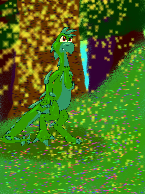
Hmm, this one took really long. Yet again, the background was the most fun part to do. So was the highlighting =D Lesse... seven layers in all. Yay. Critique, please.  |
|
|
|
Post by Teo on Oct 8, 2006 23:17:31 GMT -5
Oooooo... he looks good... and now I know what you mean by "sparkles".
I absolutely love how you drew'm, he just has that look in his eyes... and that form that says, "Bring it." Very nice indeed.
Only critique I have is the ground. Shading in the ground might make a more realistic effect... but that's all for critique.
Flowers in the grass and sparkles... *touches*
|
|
|
|
Post by penguinyoshi on Oct 8, 2006 23:21:20 GMT -5
What ever you do using a spray can makes things looks horrible unless if its a shadow even though it takes less time it makes it look worse so do it by hand also you need to use less layered stuff it gets kinda annoying to look at the drawling itself looks amazing though, but you may want to use a little blur on the shiny parts. But your improving at an incredible rate on PC art.
|
|
|
|
Post by Zippy on Oct 9, 2006 21:13:31 GMT -5
I believe this is your best attempt yet, it turned out very well it seems. The character and the shading looks very nice. As for critique, the grass in the center of it all seems kind of flat to me. Maybe you should vary the colors of the grass so it would differ in colors and look less flat (man I'm bad at describing XD). Also, the shadow under the character, I think you should make it a little less like a circle and more like how the character is actually shaped. But yeah, you'll figure out easier ways to do these things as you gain more experience with computer art.
Awesome Job Yoshee!
|
|
|
|
Post by Masakuni on Oct 10, 2006 5:41:28 GMT -5
Whoa, he looks awesome!! I really love the background alot too...so....sparkly...
|
|