|
|
Post by Fluory on Feb 5, 2007 14:31:05 GMT -5
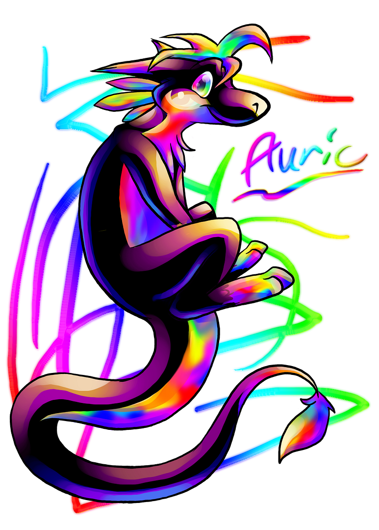
Today isn't Tuesday. ALSO! On this cloudy and cool Monday (which isn't as cool as Tuesday), I decided to finally finish a sketch I've really wanted to get done. I finally finished the first picture of Auric, my new 'net identity character thing. Fursona? What? Well, anyway, dragons have always had a particular calling to me, but.. I never could think of a design for a dragon character that satisfied me as much as Pawy's design. Oh, and Pawy is still sticking around -- she just isn't my main, main character anymore. So, here we go. Yes, it is a huge-ass file size, but.. I don't like quality getting sacrificed. dA version. |
|
|
|
Post by Yoshifrog on Feb 5, 2007 15:55:22 GMT -5
Haha, if this is sopposed to give me siezures than I am enjoying them very muchly.
I will miss Pawy as your character, but this one does a good job at replacing her. I love the design, and I can see the work that has been put into this colorful piece. I've always adored your adorable ways with the cheeks/dimples.
The rainbow underside of is really neat, and I'm loving the adorable paws on her, it looks like she dipped them in tie die paint. And I can't make assumptions, she's a "she" I presume? Correct me if I'm wrong :3
Over all the picture is beautiful. Rainbow/purple/black go wonderfully together.
Not any critique really. I don't think I can think of anything. She looks a bit hunched over, yet I think she should be due to her position.
Excellence~
|
|
|
|
Post by plebanshiren on Feb 5, 2007 16:06:03 GMT -5
He was born from a rainbow! D:
That looks really good indeed! I can't find fault with it as of now, but if I do I'll let you know (yay?)
anywhoo keep up the great work ^ ^
|
|
|
|
Post by Zippy on Feb 5, 2007 17:50:16 GMT -5
Very cool looking!
Yoshifrog got a lot that I am wanting to mention. XD This pic is extremely colorful and very beautiful with all of the rainbowiness. I just love that you shade by using different colors as oppose to a different shade of the main color; it makes things very visually appealing. The pose is very cool also, I just love how the tail flows around there at the bottom. The character itself is very neat looking and I can tell that you put forth a great deal of effort into this new character of yours. I welcome this change in characters.
Fantastic Job, Pawy!
|
|
|
|
Post by Lord of the Dance on Feb 5, 2007 22:21:28 GMT -5
Mmm, that dark top color stand out well against the rainbow-y underside. I must say, though, I like the spikes on the back of the head the most. Just the shading and the sharpness really stands out in my eyes, haha.
Those scribbles in the background make it even more colorful and lively, too.
If I must critique on something, though, I'd say one of the curves in the tail looks a little too square. The one farthest left, to be exact. You might want to smooth that out a bit if you try a similar pose again.
|
|
|
|
Post by UMS Author Lava on Feb 16, 2007 21:09:22 GMT -5
Pretty dragon...
I like dragons.
This dragon is very likable.
Heeeeee.
Must stop typing random lines.
Great work, Aurik!
|
|