|
|
Post by red.yoshi on Jun 5, 2008 19:53:01 GMT -5
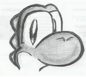
 img.photobucket.com/albums/v476/ppalganyoshi/lawlleadyoshisketch.png img.photobucket.com/albums/v476/ppalganyoshi/lawlleadyoshisketch.pngBoo!!! "What's up with that crappy color job, red?" D=. I got bored during presentations (final exam projects) so I decided to draw. No refunds when it burns your eyes right out of your sockets. Comment and Critique all welcome, although I know my mistakes as well as you can see them. Lawl. |
|
|
|
Post by Sanjo on Jun 6, 2008 19:43:27 GMT -5
Ah, c'mon, its pretty good! Who cares about color when atleast there's shading. And besides, you showed some form of interest while stufying for final exams....I usually show none what-so-ever  The only small critique that I have is about the eyelid on the far right eye. It looks more of a line than a curve, but for all I know, it could be part of his expression. One way to fix this would be to make the far eye slightly bigger so we can see more of the form of the eye, etc. I know angles are hard (trust me, I've failed numerous times  ), but keeping symmetry is important. Other than that, it looks great! SOrry to sound like a downer in the last paragraph, but hey, you asked for it, remember?  |
|
|
|
Post by red.yoshi on Jun 8, 2008 19:00:31 GMT -5
Thanks for commenting =). I like critique rather than no comment at all. I wouldn't be surprised if you were the only one to comment, lawl.
Yes, I realized that mistake while I was drawing and got too lazy to fix it. I feel as if I never take time with my art. I'm just not the patience type of guy when it comes to drawing art ,_,.
|
|
|
|
Post by Cayoshi on Jun 13, 2008 9:34:46 GMT -5
I think it's very cute; I like your style. I would have never even noticed the eyelid thing, either. LEVEL UP ! !
|
|
|
|
Post by teh yoshi on Jun 15, 2008 13:32:16 GMT -5
You know, it looks like you're really improving with this. It looks much smoother and more defined now. The shading under its nose probably looks too defined, but that could just be your style, going for that somewhat elastic look. Anyway, you keep up the good stuff.
|
|
|
|
Post by anjilfan on Jun 15, 2008 22:04:53 GMT -5
oooh! Me likes! Actually yeah, i pretty much agree with the rest.
|
|
|
|
Post by red.yoshi on Jun 16, 2008 17:22:06 GMT -5
Thanks for all the comments.~ Another thing I should've mentioned was that I didn't smear with my thumb (or paper.) The nose would've probably looked a little more decent if I tried that out. I don't like getting graphite all over my fingers though ~~~D=. Some artist I am, lawl.
(Interesting but but random fact: Firefox's spell check feature doesn't have the word "should" in its dictionary.)
|
|
Alioth
New Yoshi
 Yea my name is Joey
Posts: 11
|
Post by Alioth on Jun 22, 2008 8:44:59 GMT -5
judging on seeing this for the first time, it's actually pretty decent, especially coming from somebody that i've never heard of before. you should try photoshop sometimes, it could get you to places that you wouldn't think of getting to.
|
|