|
|
Post by sonamy on May 30, 2009 21:52:32 GMT -5
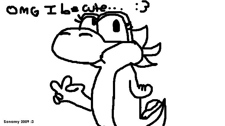
 Tell me if i need improvement... Inspiration by PWN|Yoshi... :3 |
|
PWN|Yoshi
Junior Yoshi
  I choose not to make people laugh... :3
Posts: 139
|
Post by PWN|Yoshi on May 31, 2009 9:15:16 GMT -5
Hey, that's nice:
Anyway, add some color and it's done! But it's already beautiful.
|
|
|
|
Post by sonamy on Jun 5, 2009 10:39:56 GMT -5
thanks.  ill ad some color. and thanks again PWN|Yoshi. |
|
PWN|Yoshi
Junior Yoshi
  I choose not to make people laugh... :3
Posts: 139
|
Post by PWN|Yoshi on Jun 5, 2009 19:17:37 GMT -5
np, dudette. just here to help
|
|
|
|
Post by Lord of the Dance on Jun 5, 2009 21:14:05 GMT -5
Hahaha. I wouldn't quite say it's beautiful, but it's a good start. Let's see.
You have a good, steady hand, and that's always a good start. However, the lineart could still use touching up in places, like under both the eyes, the last spike, and around the saddle. Like your best buddy there stated as well, it could use some color.
The arms are totally different lengths. You might want to at least try to do something about that. The pupils in the eyes are also off, haha.
The colon-threes peppering the paper annoy me, but that is a personal opinion of mine and you do not have to do anything about it. It is a nice doodle, but I wouldn't call it a picture yet.
|
|
PWN|Yoshi
Junior Yoshi
  I choose not to make people laugh... :3
Posts: 139
|
Post by PWN|Yoshi on Jun 6, 2009 7:57:16 GMT -5
I'll have to agree with Yoshee- It's not an actual picture yet...
|
|